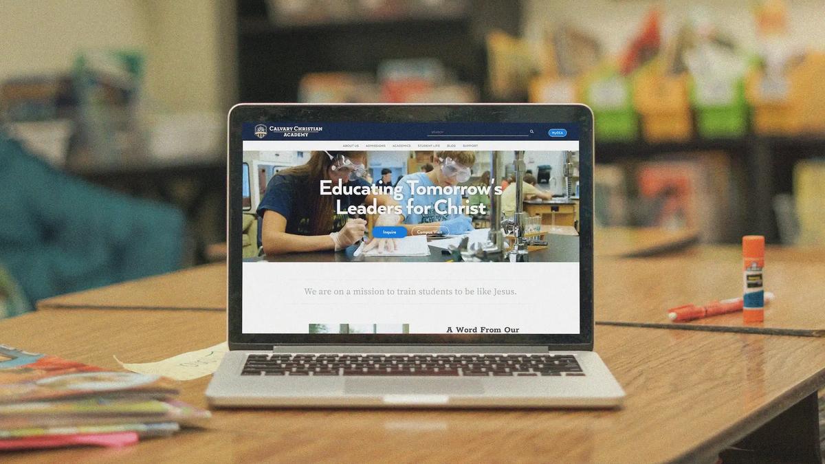
Calvary Christian Academy
A comprehensive website refresh for Florida's largest Christian school, Calvary Christian Academy (CCA).
Challenges
- The audiences for this site were parents, students and school staff.
- Parents would need to access information easily and perform occasional tasks
- Students would need to find information that was relevant to them
- School staff would need to update content and manage their classes and activities
- Information, information, information - To say there was a lot of information would be an understatement. School information, class details, athletic schedules and so much more. Sorting through the information and organizing it was the first task to be done to get a clear idea of how to approach the redesign.
- All the information was stored in Blackbaud CRM. I had concerns that the CRM could pose major difficulties not just with organizing the information but also as far as experience and interface design were going to be concerned - if we were even going to get that far.
- The final challenge was that the site needed its UI to match their “brand standards” - which at the time consisted of logo, colors (all Pantone) and a single typeface with a few very specific do’s and don’t’s. I definitely wanted to explore how far we may be able to push these to create a more engaging experience.

Solutions
Research
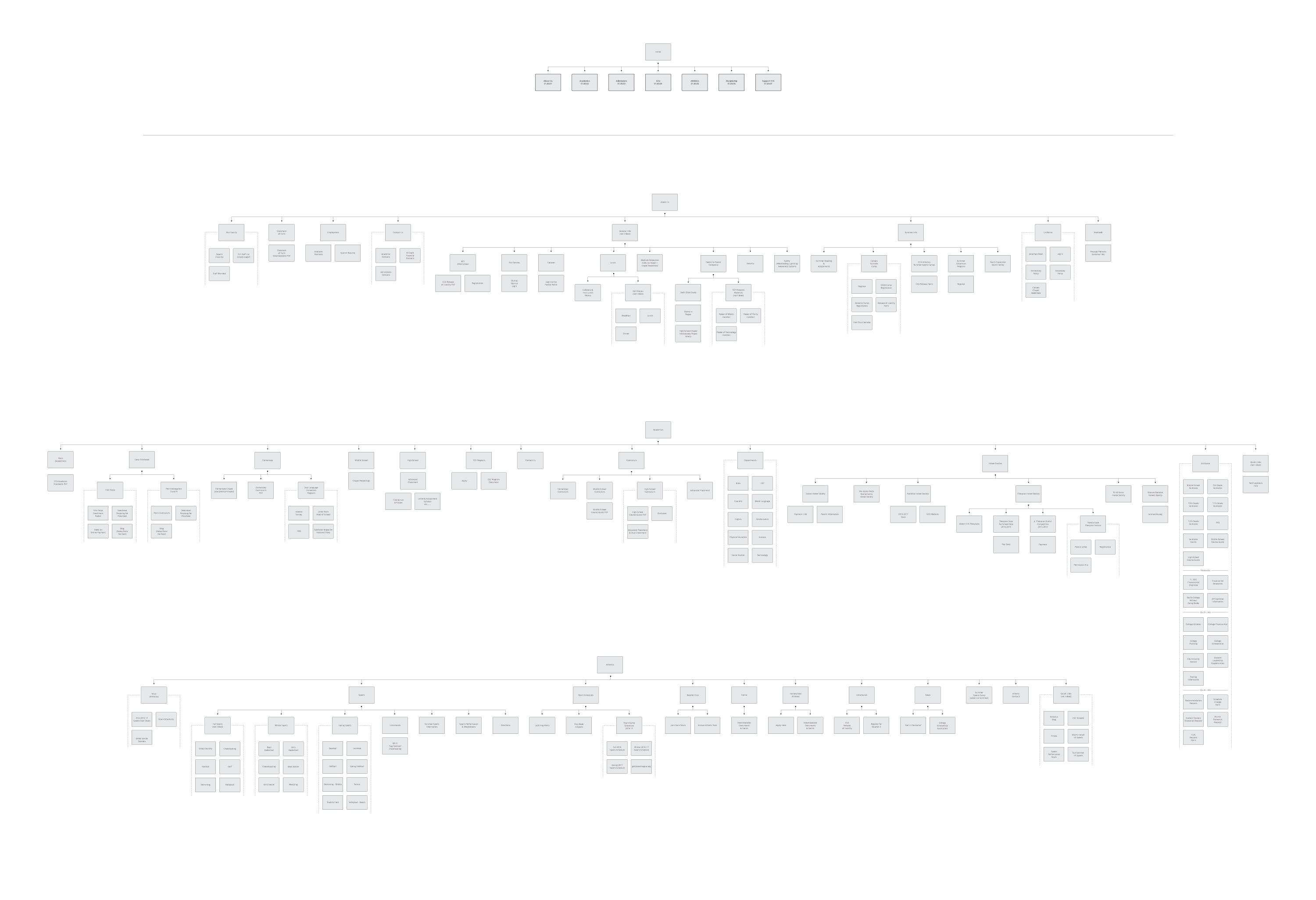
Site maps - Although not research per se, thoroughly mapping a site is a great way for me to get a good idea of the landscape, become more acquainted with the client’s world and also create a wonderful visual to have to discuss restructuring. I both mapped the site as it was and then took a stab the best I could at reorganizing in a way that would be easiest for users to navigate in Adobe Illustrator.

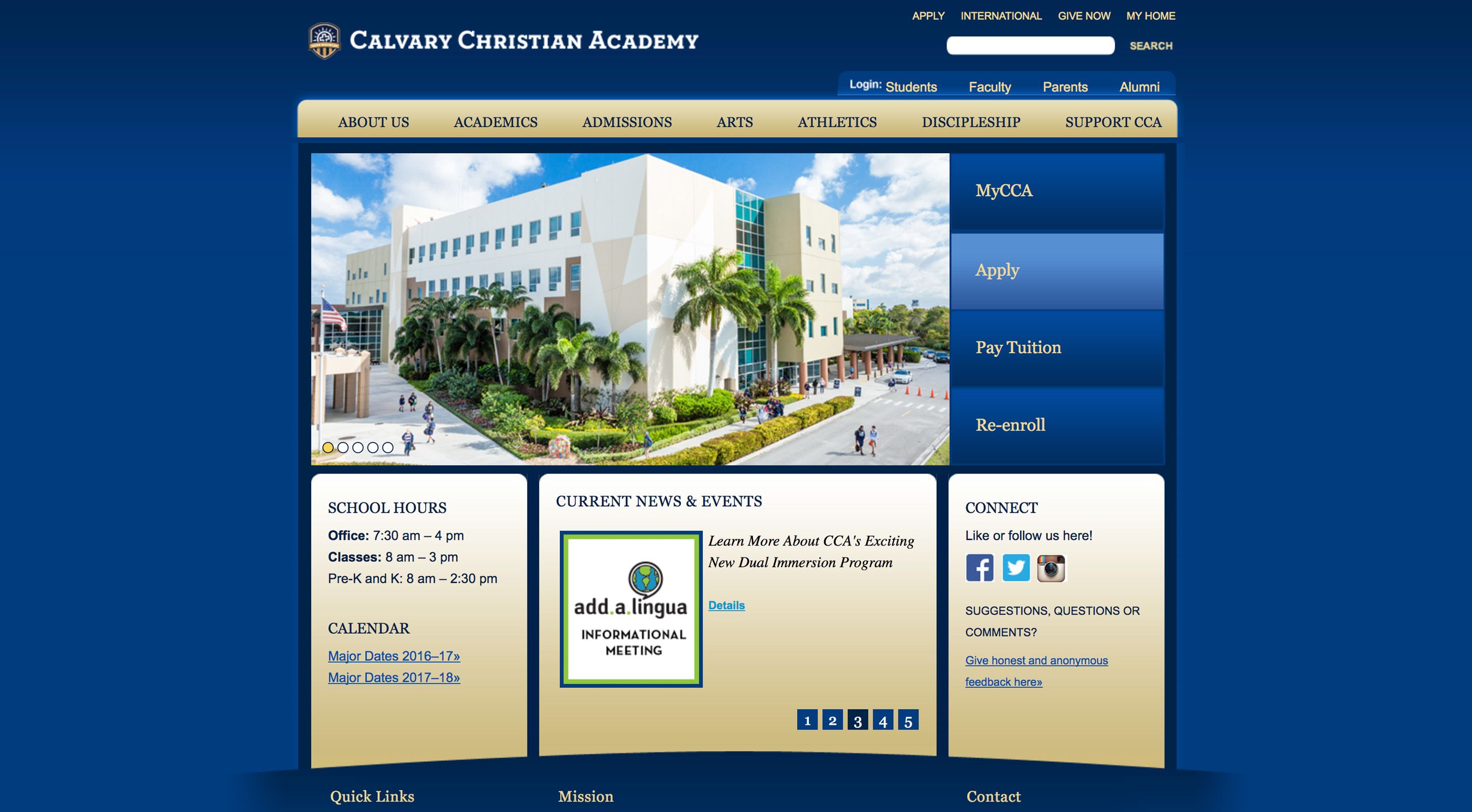
Heuristic Analysis - Detailed notes of what elements on the CCA site were good, others that weren’t good but could be improved upon and others that just needed to go.
Market research - I searched all around the web to see how similar challenges that CCA faced had been solved by other organizations. I looked at private schools in the same region then expanded to state, nation and finally world. I also expanded the search to look at post-secondary schools and even online learning platforms. I made a list of insights and thoughts on how we might consider applying some of them to the project
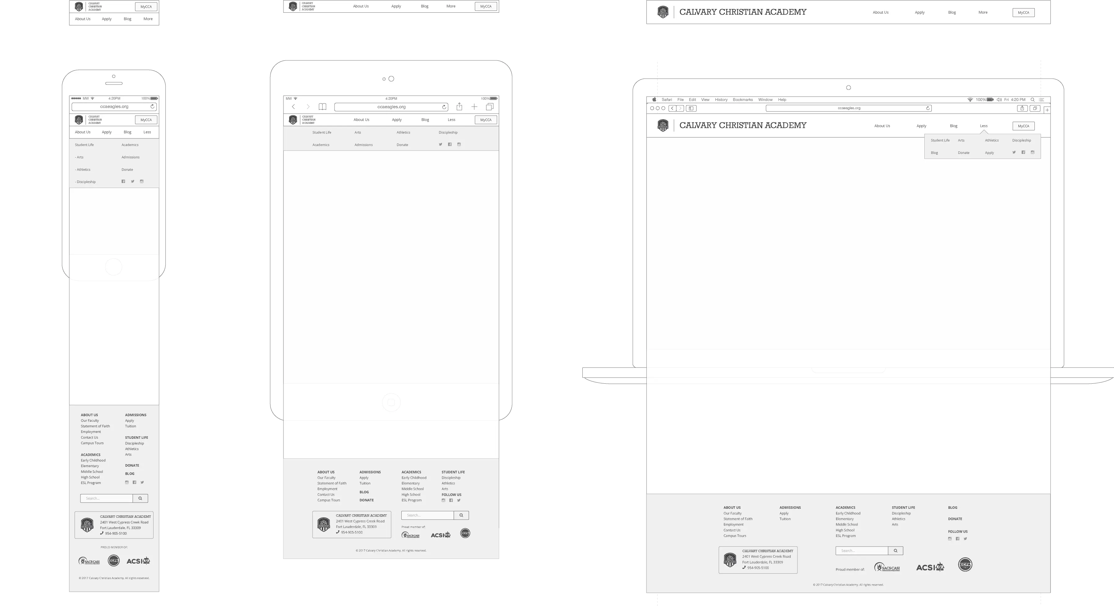
Low-fidelity wireframes - With a decent amount of subject matter knowledge under my belt, I made some high level drafts of mobile and desktop screens. Similar to the site maps, these would be good visuals to sit around and discuss before proceeding to high-fidelity wireframes and prototypes.

The CCA team was able to get me into a brief virtual Blackbaud training which helped me to see what would be possible to do and what the best practices were in the CRM. Thankfully, editing CSS and JavaScript(jQuery) were possible in Blackbaud albeit in a roundabout sort of way.
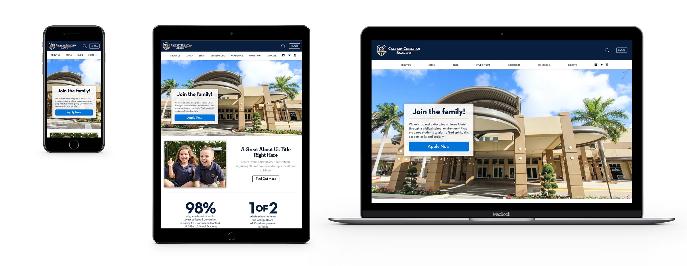
Design
I expanded the pre-existing style guide by:
- Adding a few carefully paired fonts for a better reading experience and so the typeface in the logotype wouldn’t lose it’s place in the visual hierarchy due to overuse.
- Adding a some colors to the palette including a brighter blue for call-to-action buttons and a few shades of grey for use with type.
- Creating a new logo lockup for use on the mobile header
Wireframes
I used Sketch to create high-fidelity mockups with all colors, fonts and layout styles I had in mind for the stakeholders to review. There were a few revisions but overall they were approved.

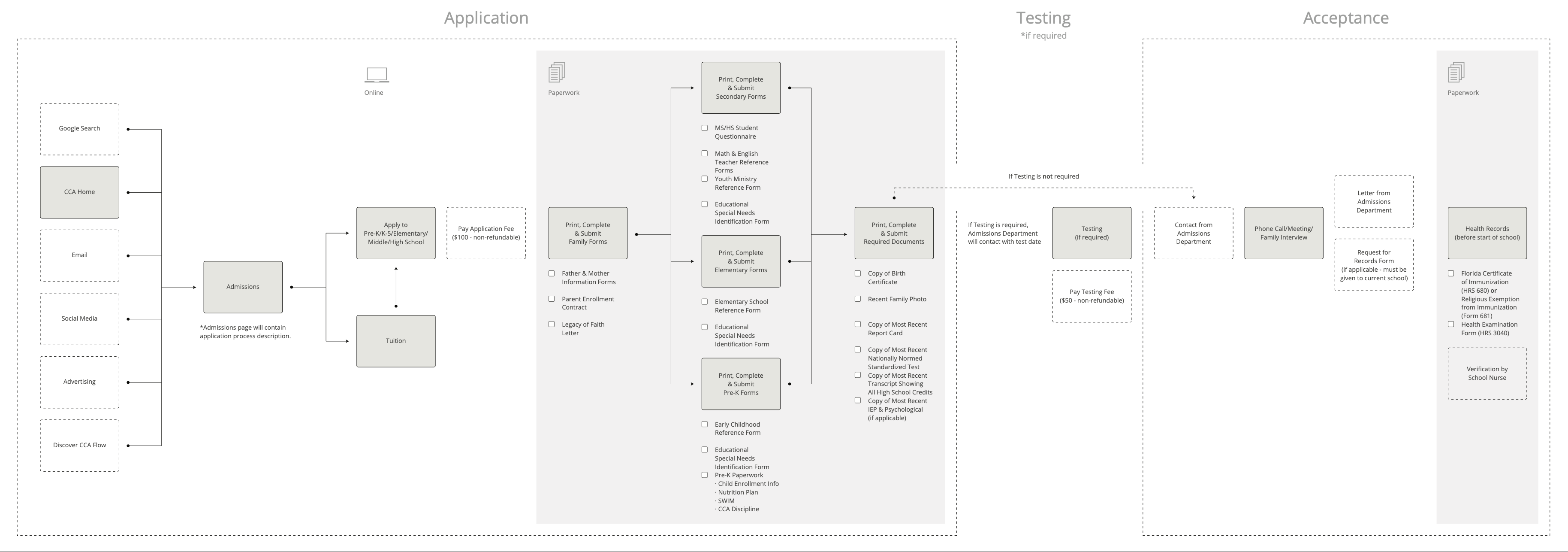
User flows
I created several user flows based on different user behaviors. The application flow was the primary goal that we would be funneling users through.

Prototype
Since this project didn’t require custom animations, state-changing or any complex interactions, I forwent prototyping to begin developing.
Development
Because of how Blackbaud is organized, it was necessary to tackle the development in 5 parts:
- master pages
- reusable elements
- layout zones
- global CSS
- embedded scripts
The development process was very tedious because every change needed to be saved several times in several places before it was possible to even preview what you’d done. Since the high-fidelity wireframes were very detailed, it just became a matter of pushing through the repetitive editing tasks. Finally, it all came together and the site was hailed as a wonderful refresh - especially by those who worked for the school who were the ones who would maintain it - which to me was a great encouragement.